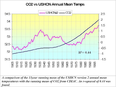
First up, a graph of CO2 against US temperature. Note the low r-squared correlation of 0.44.

That is quite a profound non-correlation. How's CO2 looking over the last 10 years or so?

An r-squared of 0.02? Oops. Random noise has a higher correlation than that!
Of course, the unscientific loons who buy into climate change propaganda will start by bashing D'Aleo and then follow up by stating that correlation with the US record is irrelevant - that's why it's called global warming.
So, let's have a look at CO2 vs the CRU global and MSU lower tropospheric monthlies over the same period:

CO2 is meant to be the primary
forcing agent accounting for more than 60% of all forcing agents. For that to be the case then the above graph is impossible.
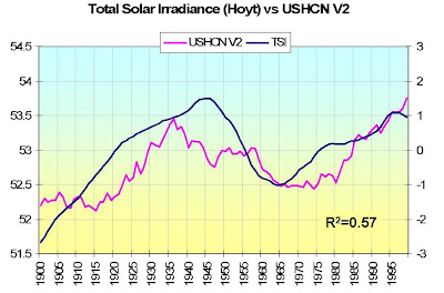
Is there anything that does have a good correlation?

The sun has a higher correlation than CO2. Imagine that.
D'Aleo then hit upon an idea:
Since the warm modes of the PDO and AMO both favor warming and their cold modes cooling, I though the sum of the two may provide a useful index of ocean induced warming for the hemisphere (and US). I standardized the two data bases and summed them and correlated with the USHCN data, again using a 11 point smoothing as with the CO2 and TSI. This was the jackpot correlation with the highest value of r-squared (0.83!!!).

In summary:

Definitive? No. Interesting? Yep.
However, does it kill the idea that CO2 is the primary forcing agent of climate? Pretty much.
(Nothing Follows)

3 comments:
Let me see if I can make a question out of what's in my brain.
Your second plot was TSI (total solar irradiance) against temperature. How is that measured? Are we measuring solar radiation from ground stations or from satellites?
Your third plot was the Pacific Decadal Oscillation + the AMO (what's AMO stand for?). That had the highest correlation you presented.
What correlation would there be between TSI and the PDO+AMO? Does anyone measure the cloud cover on the oceans?
As always, any old bullshit will pass for science in Lactonland. A graph that is actually worth looking at is one that stretches back not just a decade (a timescale over which you must surely know that weather variation overwhelms any long term trend) by over the last century and a half - like this one. What do you see?
What do I see in the graph?
SPLICED TEMPERATURE DATA!
Post a Comment